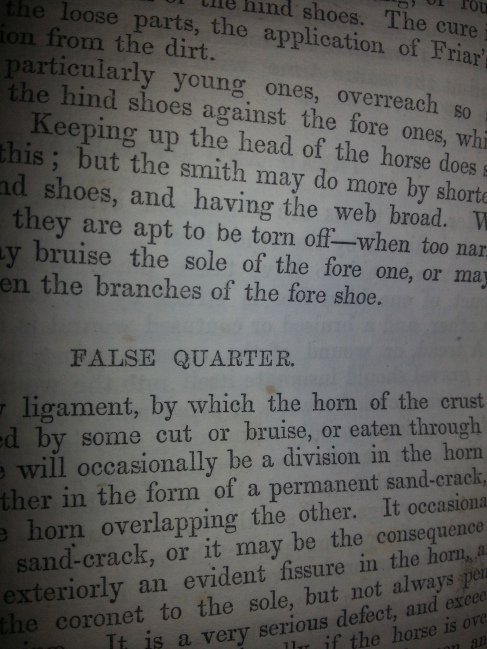
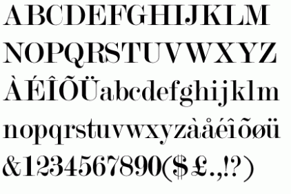
In what font would a veterinary equine book that was published in Auburn, New York be? That’s a good question to answer, and a rather difficult one as well. It was quite a journey for me to find out the answer to what seemed to be a simple question. My search started by using Identifont in an attempt to help determine the font used. The result of this search was called Modern No. 20, and it debuted in the year 1905. I immediately ruled this out as a possibility of my 1851 book’s font. I continued my search, looking for an older style font until I finally determined that it must be from the category known as Modern Fonts, also known as Didones.
Didones are a group of what are known as Modern fonts that were created by French printers Firmin Didot and his father Francois-Ambroise Didot. The Didot family made remarkable contributions to the arts of typography and printing. Francois became the first to print on vellum paper and is credited with adapting the point system used in sizing typefaces to be based on 1/72nd of a “French Inch”. His son, Firmin was an inventor of stereotypography, which is the use of a metal printing plate for setting type.
I believe that my book is privileged enough to have these remarkable artists as the creators of the Victorian-style font that my book was been printed in. The beautiful S shape of the Q tail along with the elegant curved 7 is what pointed me in the direction of this Victorian-style Didot font. Unfortunately, no name for this font was discovered during my research. I did discover however that this beautiful font was made into a modern-day rendition by the Stephenson Blake foundry in 1905. This interpretation of my book’s lovely font was named Modern No. 20. Amazing discovery right? Identifont had identified the modern-day version of the font my book was printed in, showing just how remarkably similar the original and the rendition are.
Passage from Book
Modern No. 20 Font


